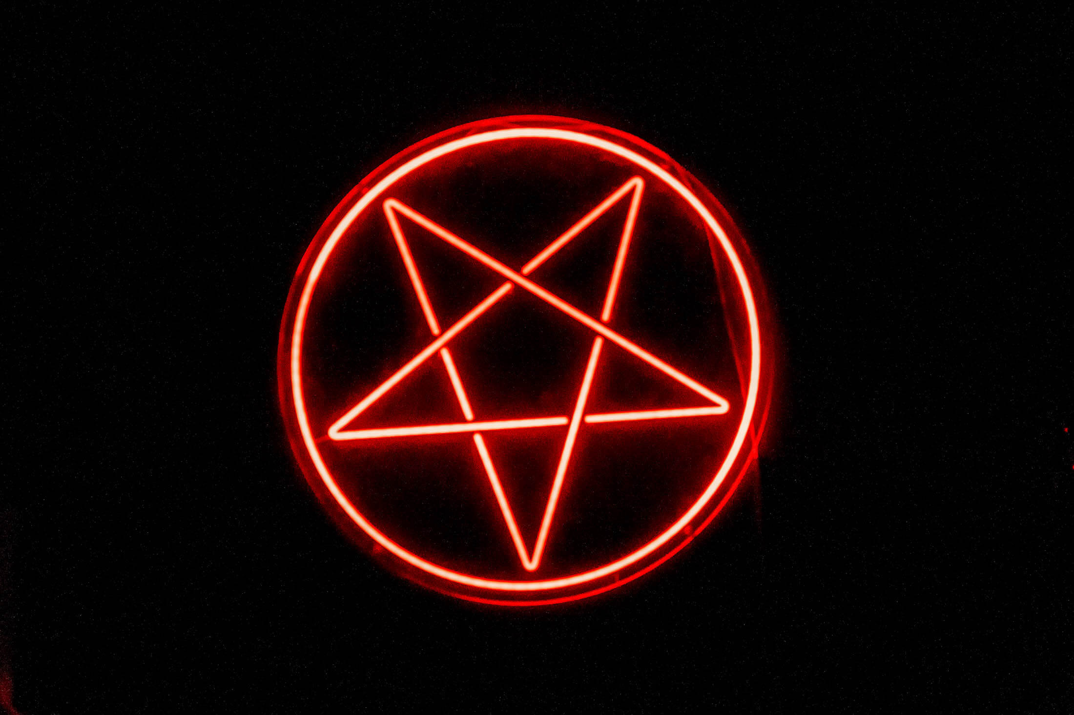
When Houston’s underground favorite, Brash Brewing, returned to its original leadership, they brought us on board to help build a new brand identity. They wanted the brewery to return to its roots. To be dark, mysterious, ominous, and inspired by the metal community that calls it home.
Logo & Identity Design
Voice & Tone Guide
Label Design
Event Branding
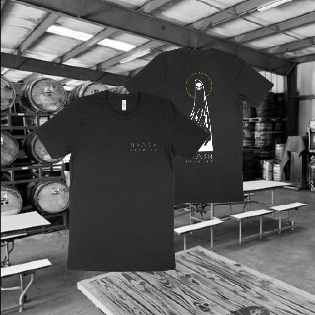
Merch Design
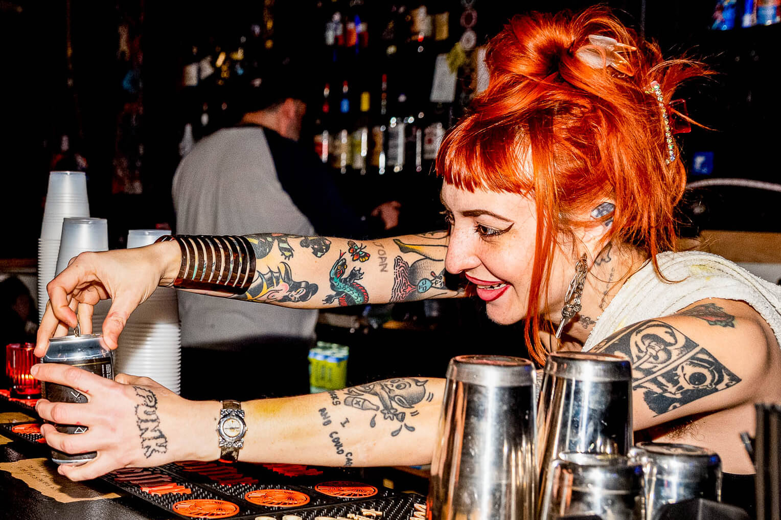
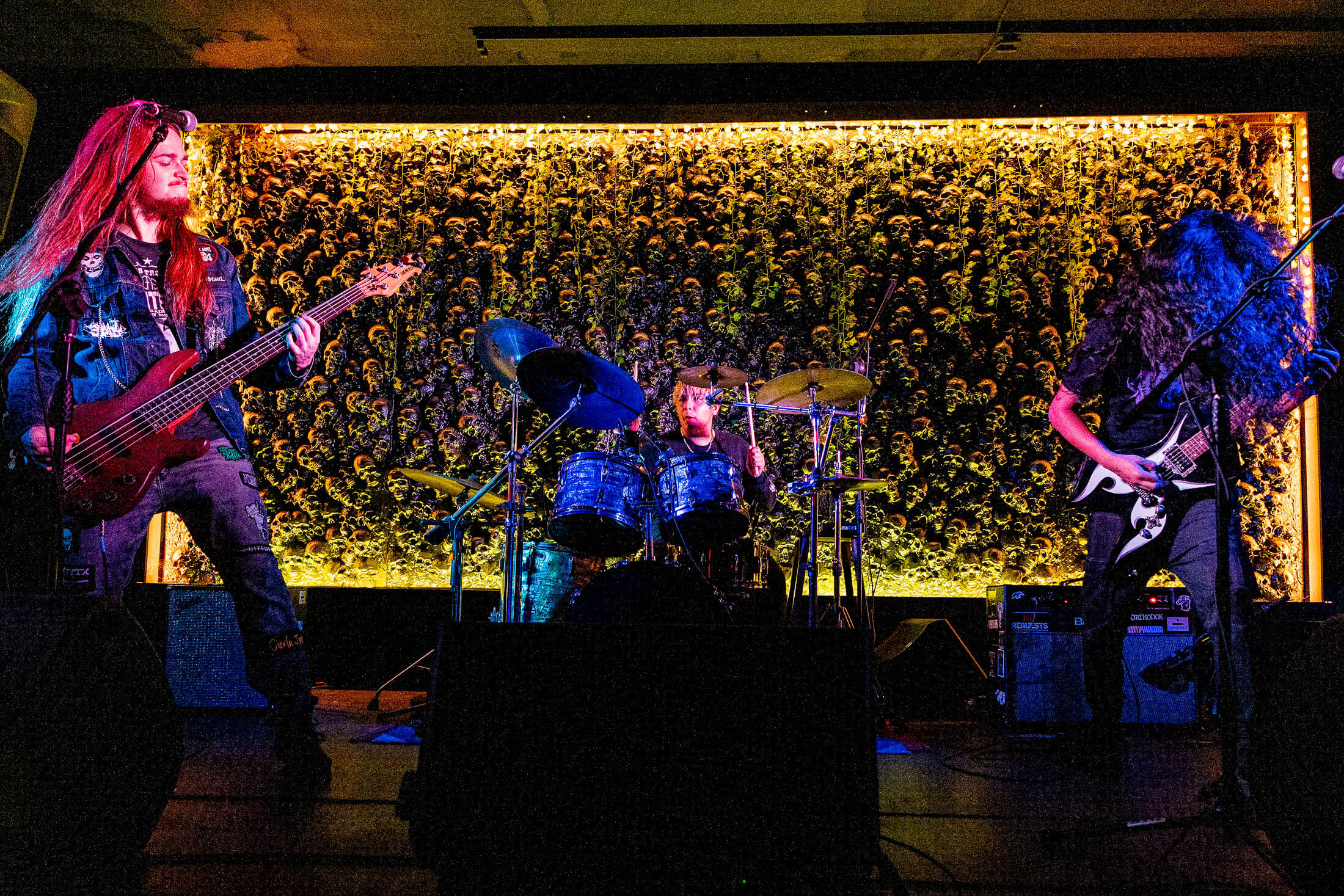
Photography
Design Audit
Design: Zach Harris
Photography: Jennifer Lake; Retouching: Stout Collective
![]()
The first step was for us to fully understand who Brash is, and to dig deeper than just a “metal brewery.” We honed in on a Brash that was mysterious and uncompromising.
Offering authenticity for the unsatisfied, it’s confident. Unsettling. And a home for people that aren’t willing to settle for things as “they should be.”
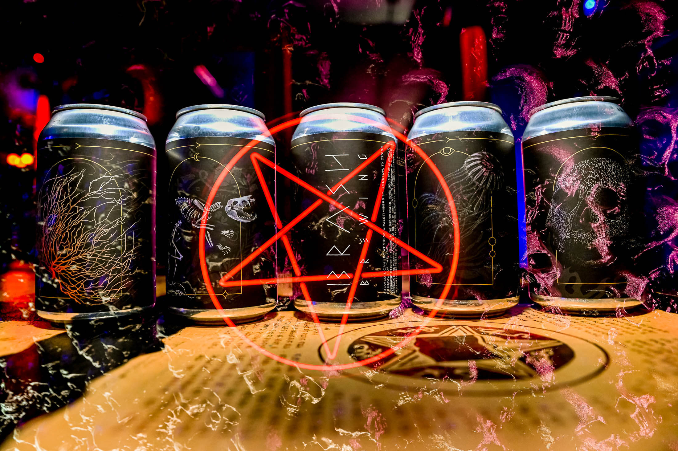
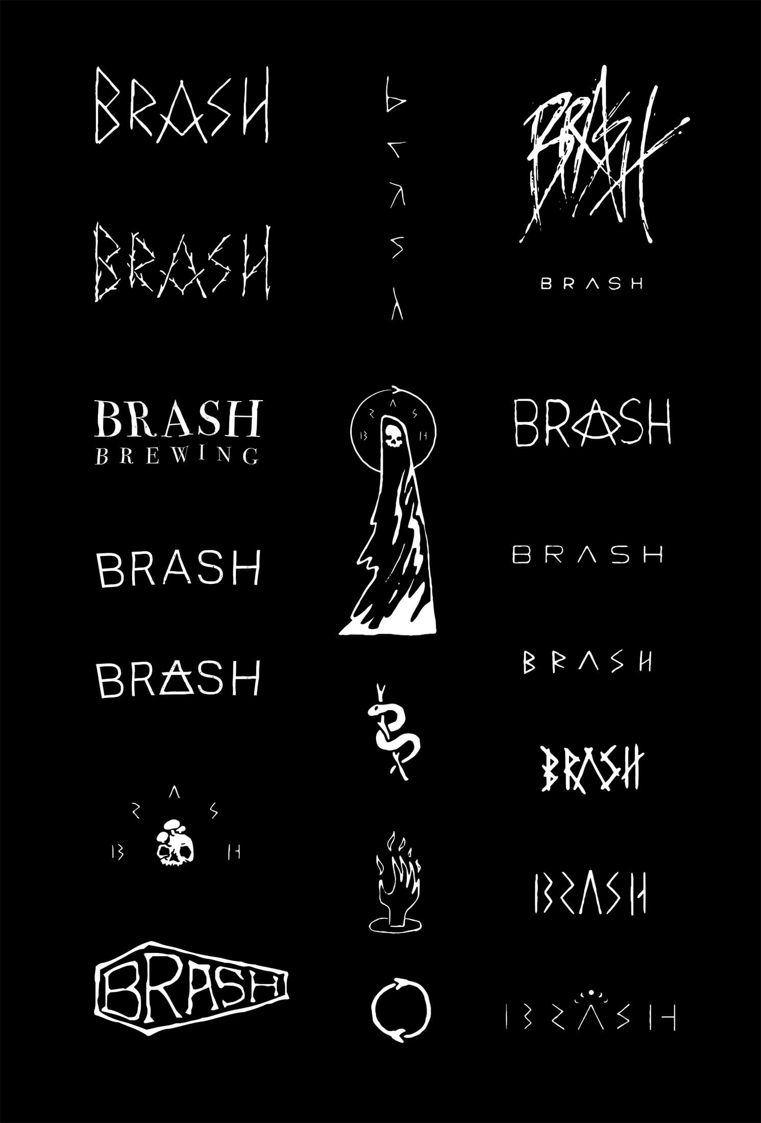
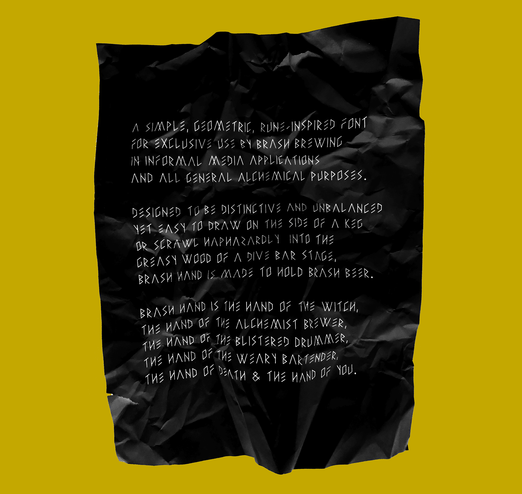
We worked with long time Stout collaborator, Zach Harris, to help build a visual identity that stands on three pillars: an eerie wordmark, an ominous figurehead, and an ouroboros to act as a frame that ties everything together. The three elements together make up a more confident, wizened Brash.
“A new Brash emerges from the ashes of old, ancient bones reveal a new skin. The being of Brash is both everyone and no one, an anonymous force of strength and wisdom, borrowing from the truth in nature and the purity of sound.”
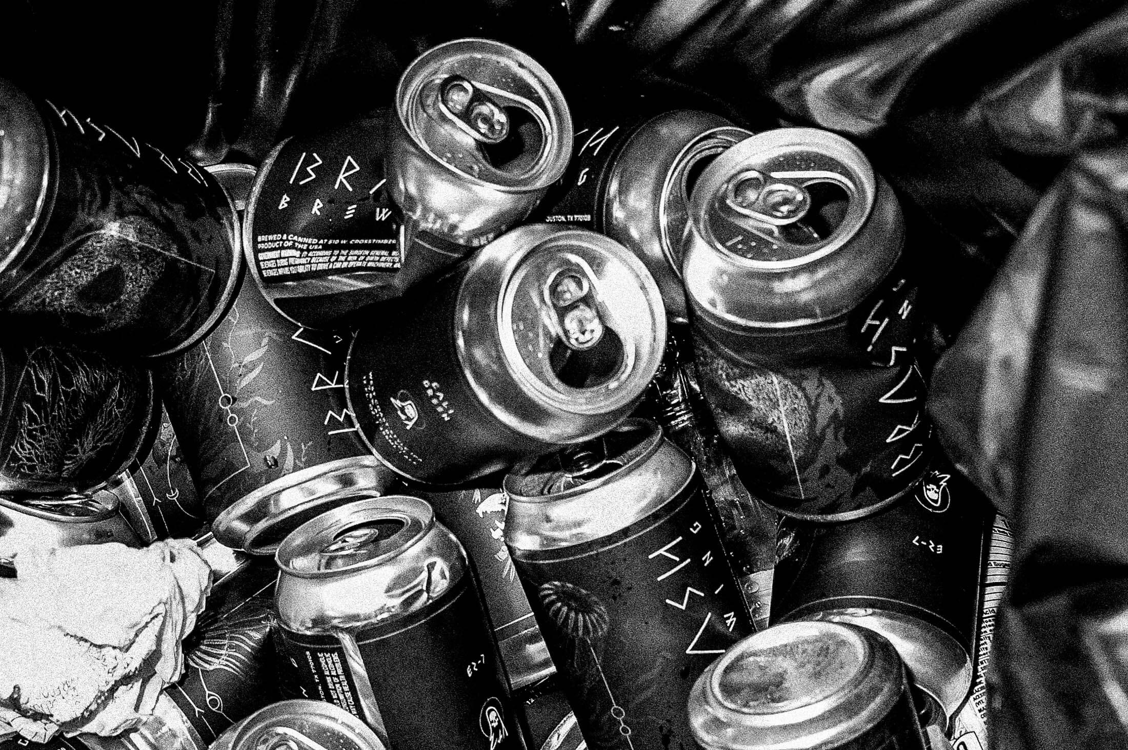
Each Brash label is centered around a single illustration, usually a figure, and then surrounded by a subtle texture that suggests its environment. It’s strong and silent – black and white with a slight touch of color and subtle use of metallics.
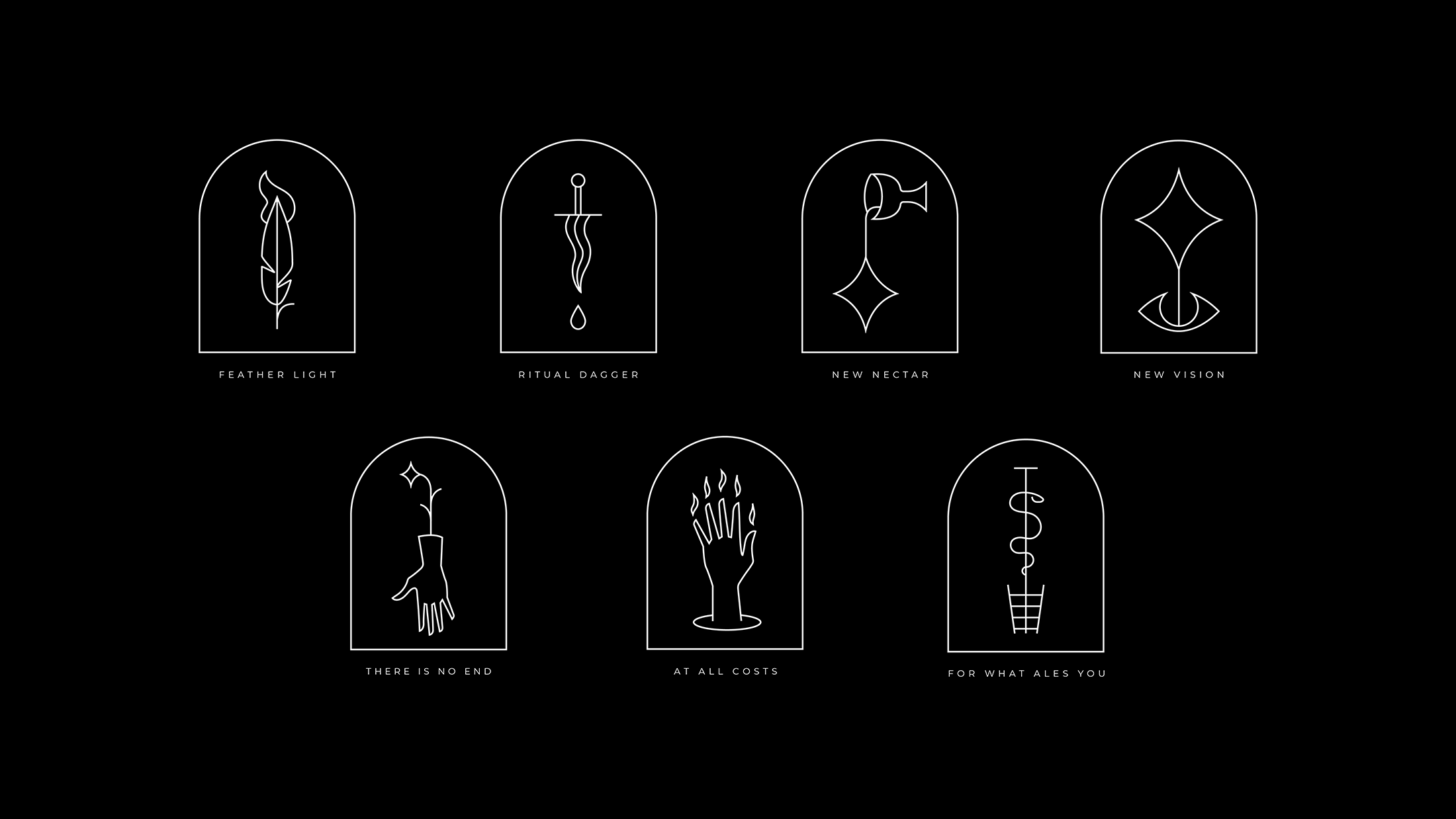
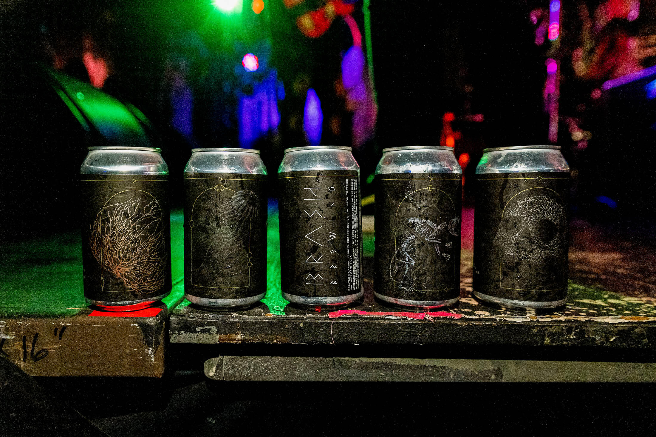
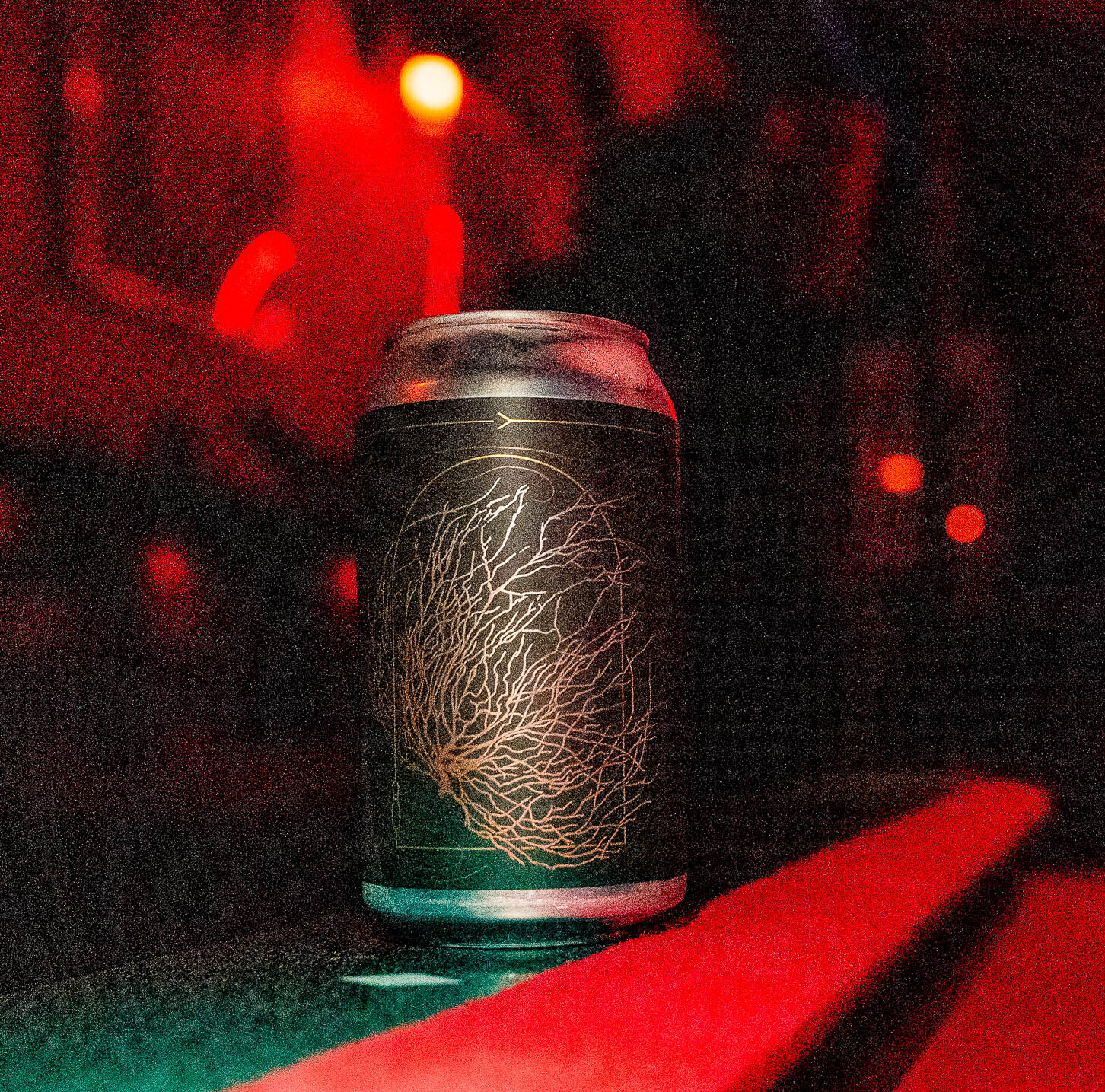
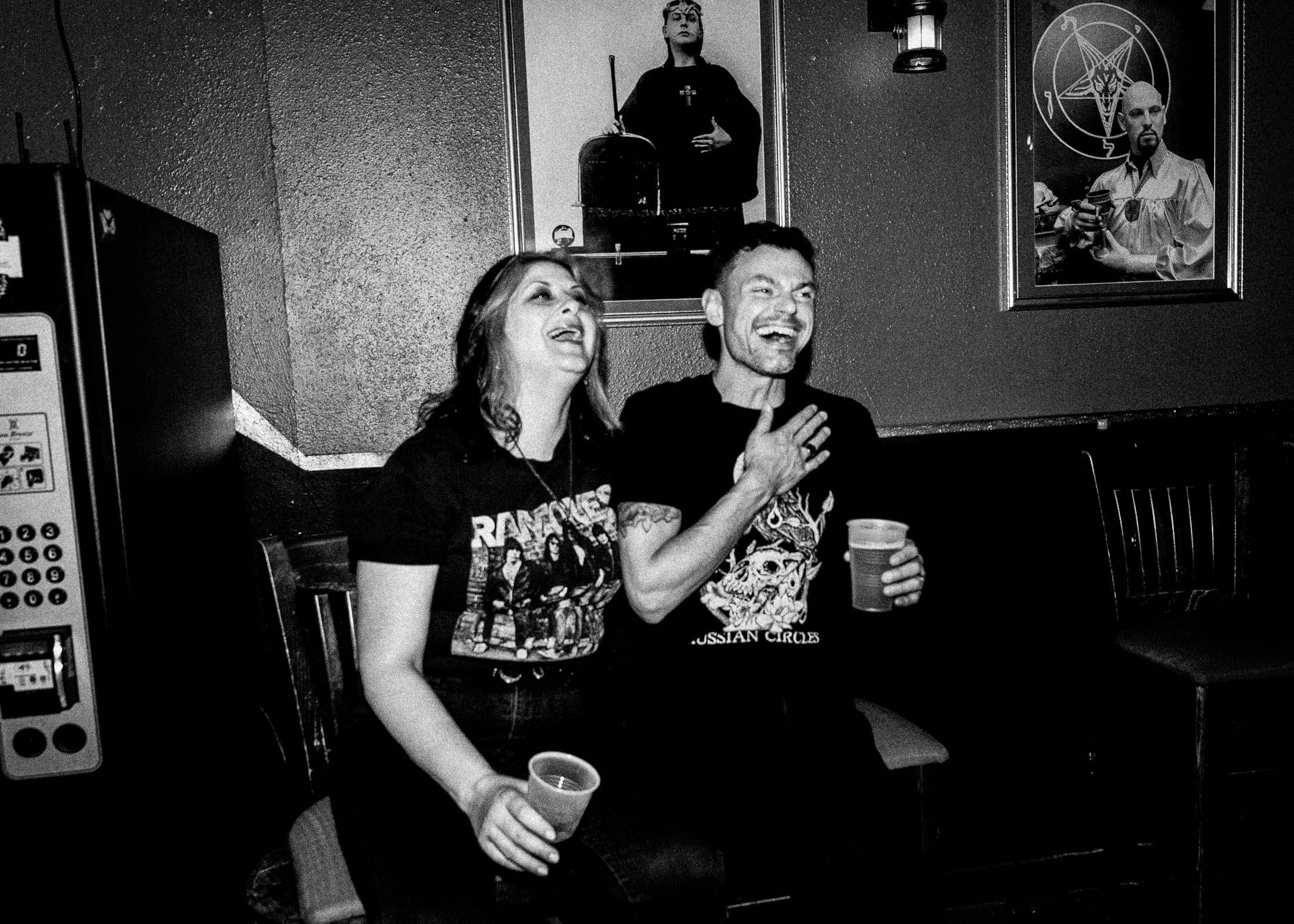
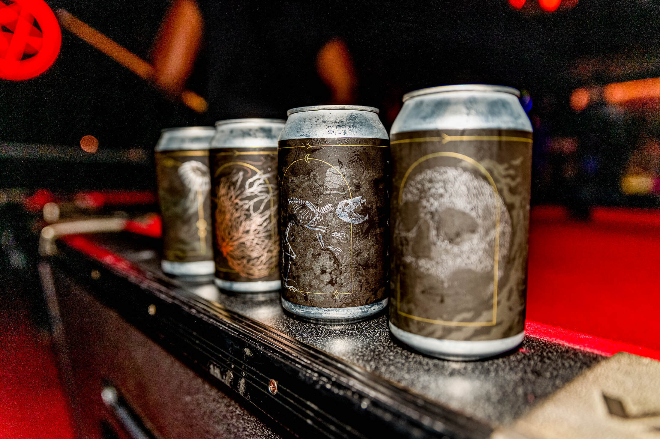
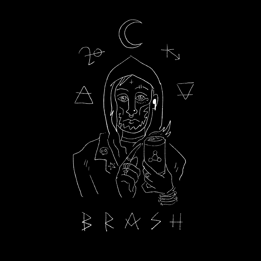
Brash looks to the gruesome parts of the natural world to reflect its darkness. It’s a fight against (or surrendering to) decay and rebirth, with design that feels natural and organic, with lots of motion.