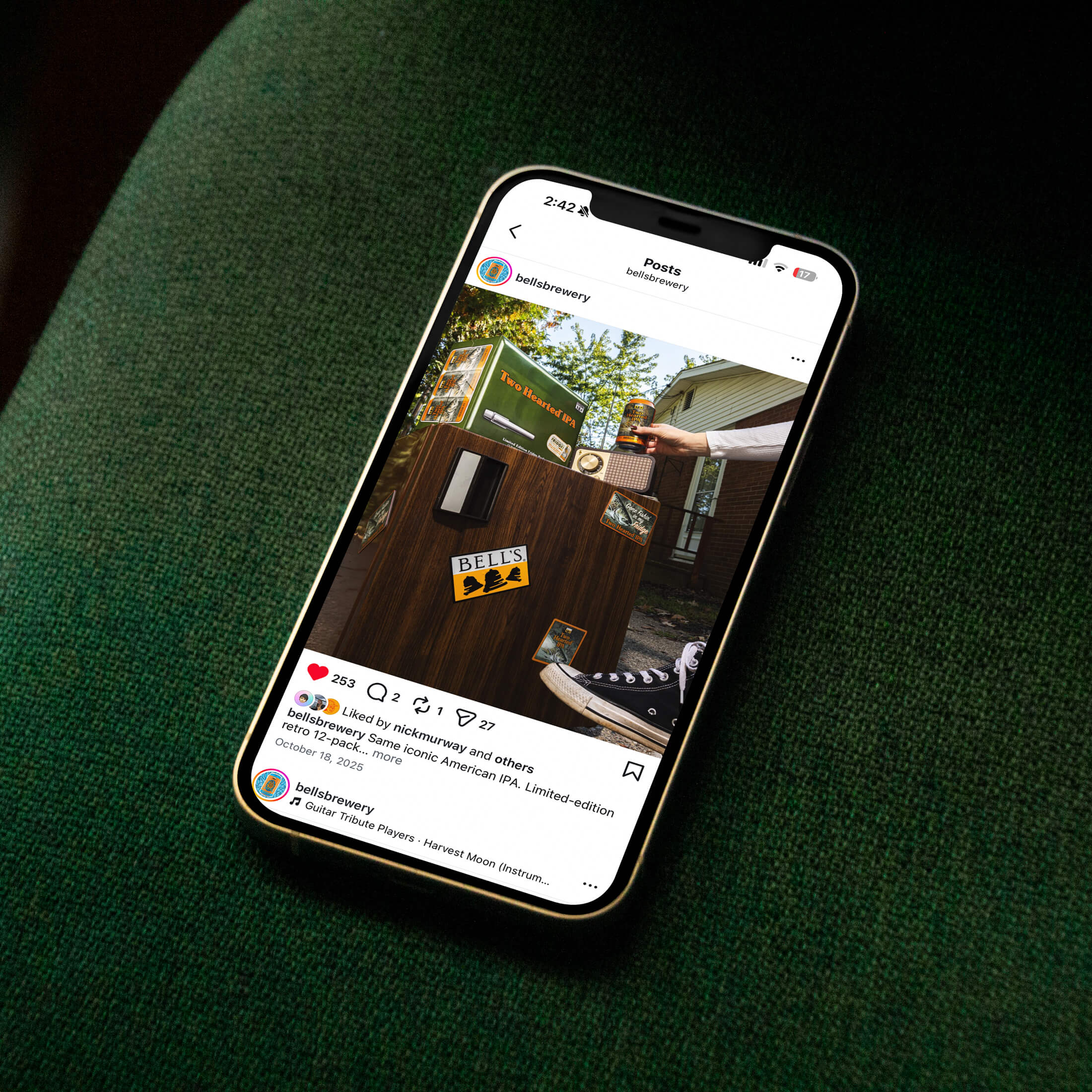
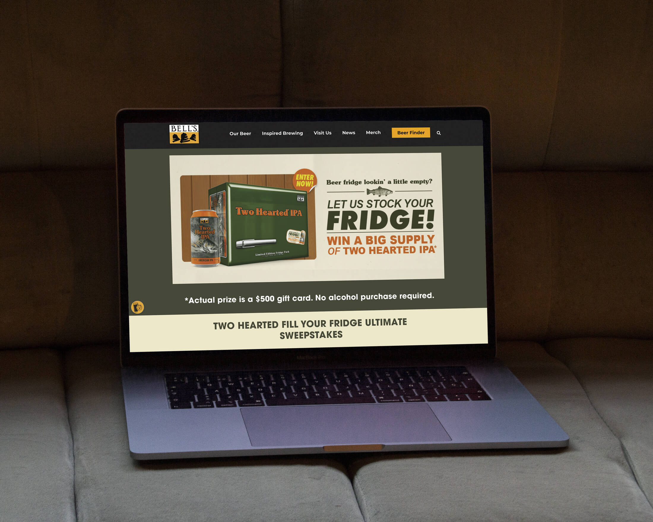
Bell’s Two Hearted IPA is one of a handful of craft beers that has become synonymous with a region and a culture, winning awards and leading the market nearly 30 years after its 1997 debut. So when Bell’s Brewery asked us to develop a limited-edition 12-pack to drive off-premise sales heading into fall, we knew the stakes. The packaging couldn’t just look good. It had to build on an already iconic story without losing the recognition that made it iconic in the first place.
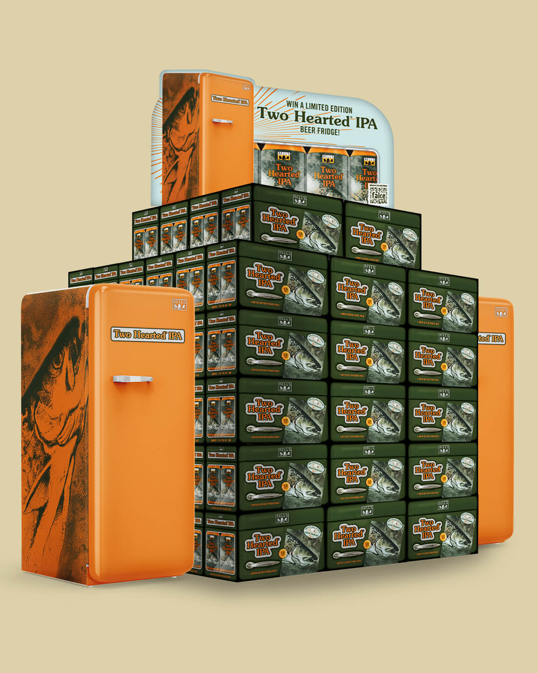
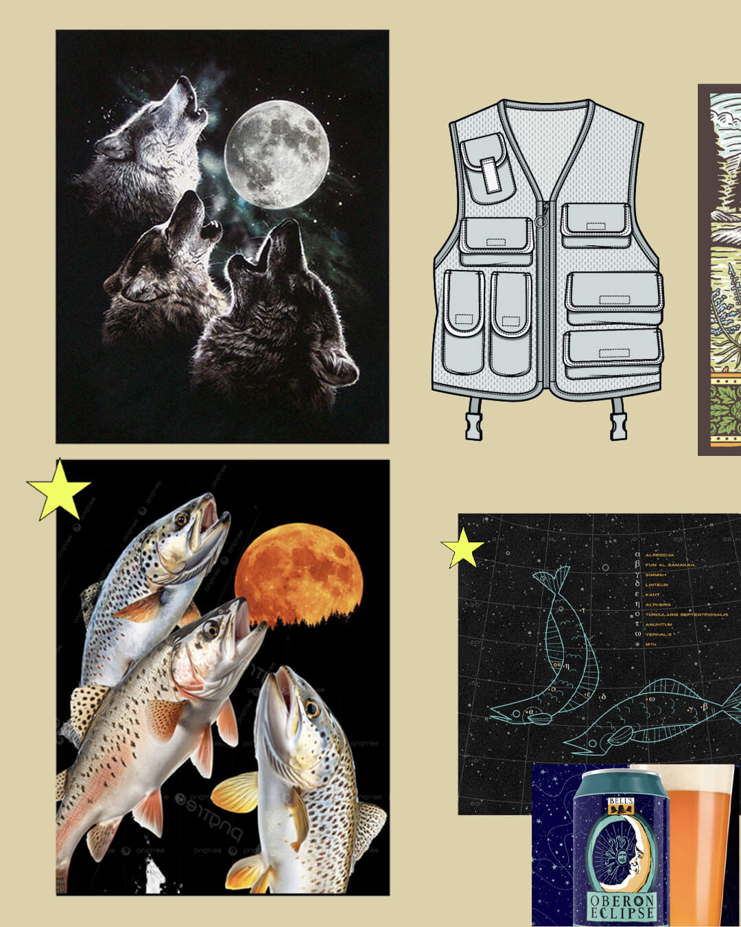
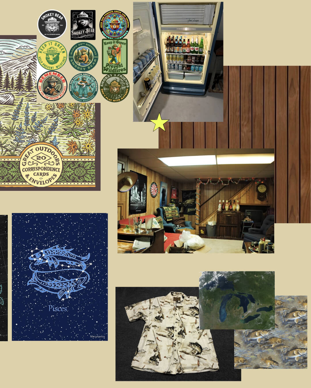
We explored a range of brand-centric concepts: the harvest moon, camouflage, fishing gear, vintage Great Lakes poster art, but the winning idea was the most universal: the beer fridge. If you’ve spent any time in the Midwest, you know the one. It’s in the basement or the garage. It’s the oldest appliance in the house. It’s where the Two Hearted lives.
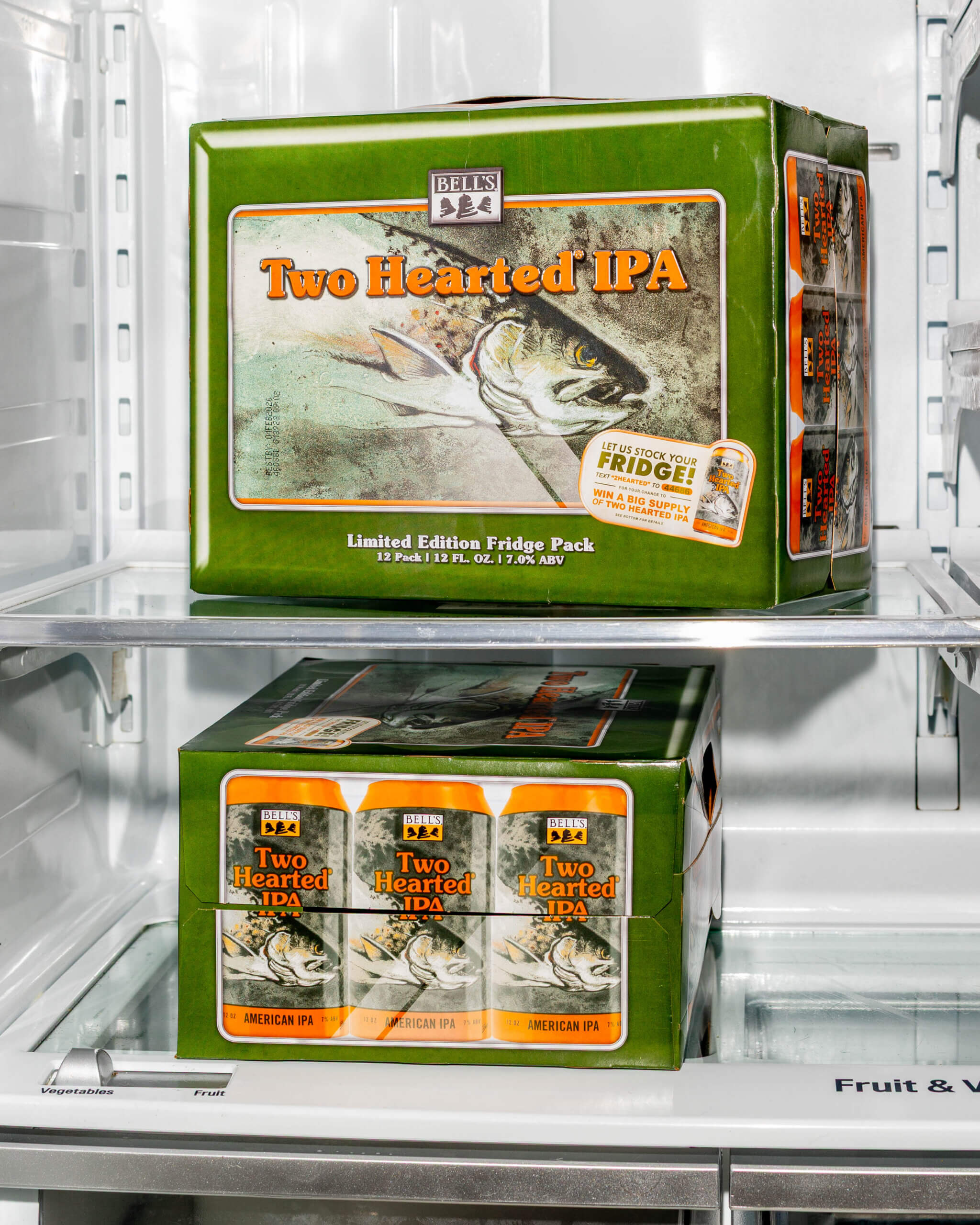
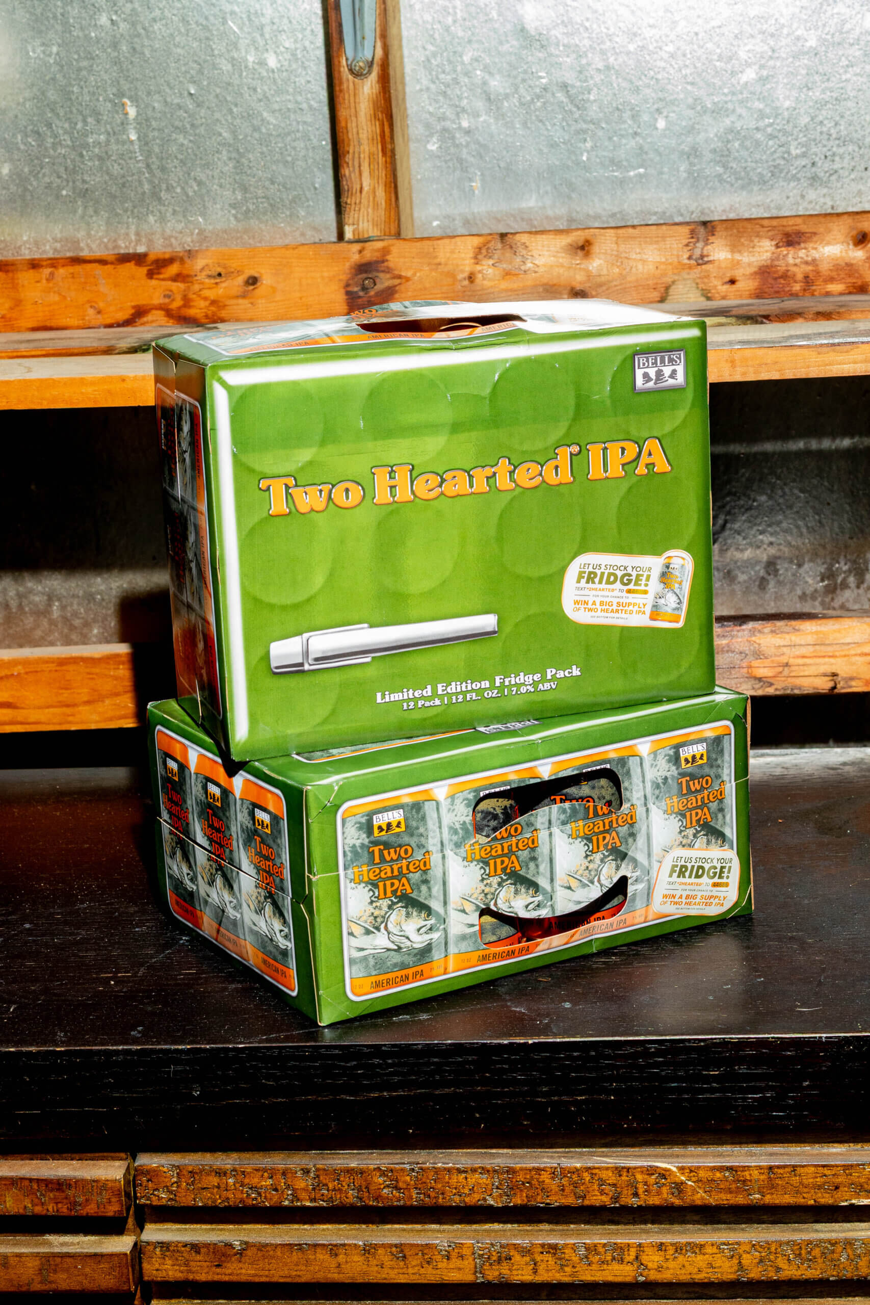
The 12-pack was designed to honor the beer fridge: the metallic sheen of the door, an era-specific handle, an embossed logo, and side-panel “windows” that reveal the cans inside, all rendered in Two Hearted’s existing colors and fonts so the package was new and instantly familiar at once.
This box earned its place on the shelf not by chasing trends, but by going deeper into what makes Two Hearted Two Hearted and trusting that authenticity to do the work in a crowded aisle. That’s the job: find the thing that’s already true about a brand, and make it stop you in your tracks.
Creative Direction
Packaging Design